
Background
Data Visualisation and Sensemaking
The goal of this project is to support ‘Sensemaking‘ with Data Visualisation and/or Machine Learning. What is ‘Sensemaking’? This is a video of me explaining what Data Visualisation and Sensemaking are:
Sensemaking Model
Below is a diagram showing the different stages of sensemaking (the ‘Pirolli-Card model’) discussed in the video. From the bottom left:
- Searching for relevant data
- Extracting useful information
- Form of an understanding of the important factors and their relationships
- Forming and testing hypothesis
- Comparing different options and making decisions
- Presenting the results and decision process to others.

For example, a sensemaking task can be ‘finding the best camera under £500 for baby photos’, then the steps above become:
- Searching for information about camera, such as the reviews/recommendation and camera price/pixel number.
- Find the information that is relevant to you: matching use case (such as baby photos) and price range (no more than £500).
- Understand which factors are important to you (such as sharp photo) and how is this affected by other factors (such as large aperture).
- Use the understanding to form and then test hypotheses what types of cameras may meet your requirements, such as ‘will a phone camera be good enough or I need to get a mirrorless or DSLR?’
- Then you will need to research and compare different camera models and make a decision
- Finally you need to communicate the results to others (such as your parents or partner) and convince them this is the right choice.
There are many other sensemaking examples in our life, such as planning a holiday and selecting a university/degree to study. There are also many, many applications in business, medical, defence, and other industries. Academic research itself is also sensemaking.
Research Questions
The fundamental issue is that most of the sensemaking steps are done manually without support from specialised tools. This make it a bottle neck in Big Data analysis (for example the dozens Chrome tabs shown below).

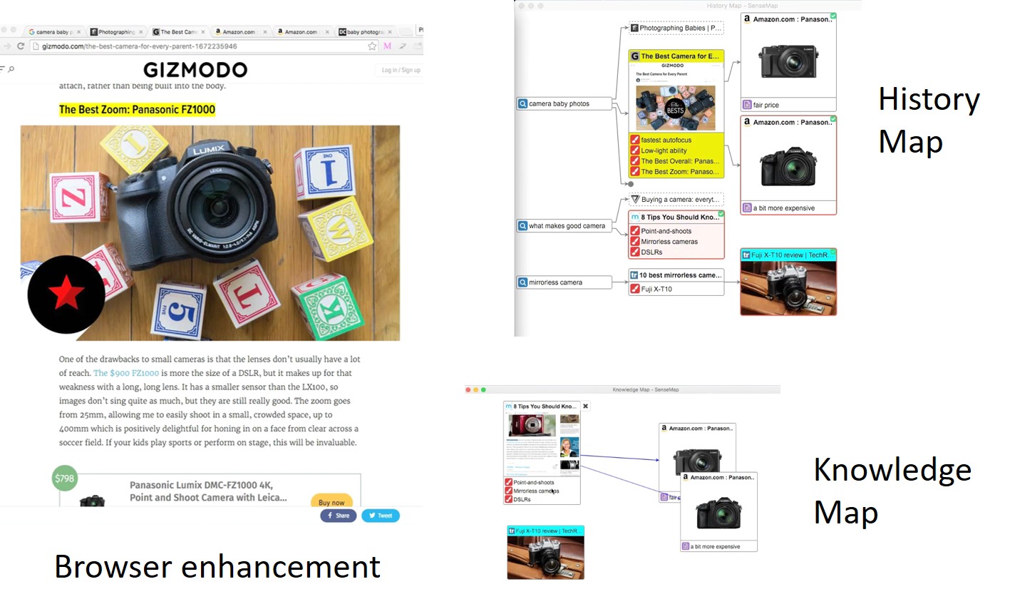
The project aims to design and develop new tools to better support. Some progress has been made such as SenseMap (for users, screenshot below) and SensePath (for researchers trying to understand user data), but there is still a lot of work to:
- RQ1. Cover all the stages of Sensemaking: currently SenseMap only covers Step 1 & 2 in the Pirolli-Card model above; more work is needed for the rest of the pipeline (Step 3-6).
- RQ2. Support different use cases or application domains: SenseMap is designed for online shopping and it might not work well for other sensemaking tasks such as holiday planning.
- RQ3. Crowd sourcing and comparative review. One of the common sensemaking tasks is to compare different options. Can we crowd source such comparisons, i.e., a user can see similar comparisons other users did, so he/she does not have to repeat the same sensemaking process. Also, this can create relative reviews, i.e., one product is better than another in certain aspect (such as auto focus speed for cameras). This is different from absolute review, such as the 5-star review used by Amazon, which provides an overview but does not always meet users’ preferences.
Here are some previous student projects: project1 and project2.
Readings
- SenseMap: Supporting Browser-based Online Sensemaking through Analytic Provenance (webpage, Github, presentation)
- Survey on the Analysis of User Interactions and Visualization Provenance (website, presentation)
- From Information to Choice: A Critical Inquiry Into Visualization Tools for Decision Making (TVCG 2023)
Event sequence analysis
A Survey on Visual Analysis of Event Sequence Data: https://ieeexplore.ieee.org/document/9497654/
Multi-Attribute Comparison
LineUp: Visual Analysis of Multi-Attribute Rankings (TVCG 2013)
SkyLens: Visual Analysis of Skyline on Multi-Dimensional Data (TVCG 2018)
Podium: Ranking Data Using Mixed-Initiative Visual Analytics (TVCG 2018)
RankAxis: Towards a Systematic Combination of Projection and Ranking in Multi-Attribute Data Exploration (TVCG 2023)

You must be logged in to post a comment.